F.M.P Week 15

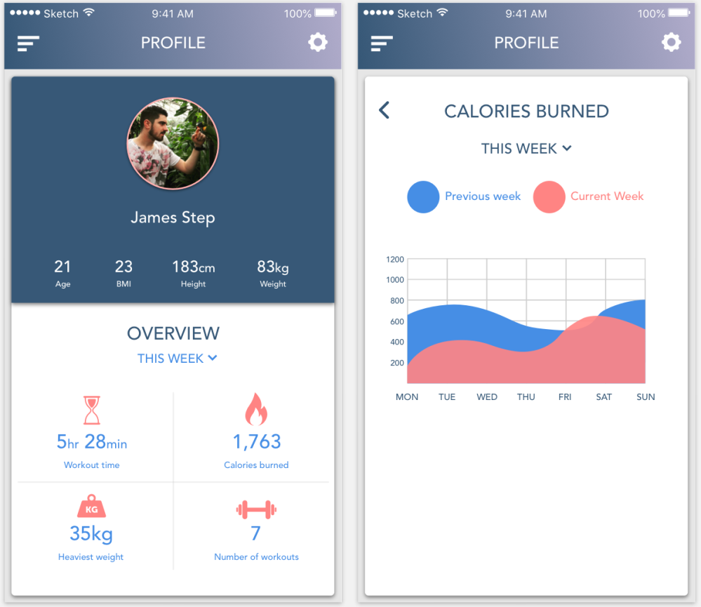
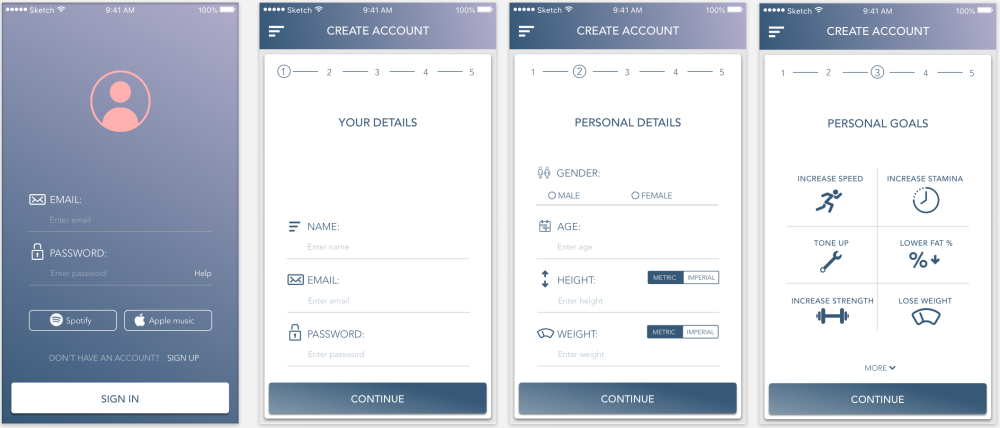
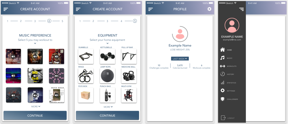
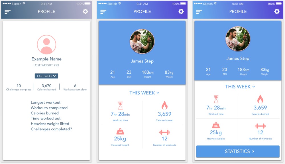
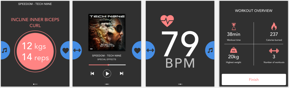
I thought that it would be important for the user to be able to go onto their own profile page and be able to view some of their stats and workout results. I started off by just including the name, goal and some basic numbers, i then added some more personal details in small, then more important details with icons and larger numbers.

Screen Shot 2018-06-06 at 20.24.09.png

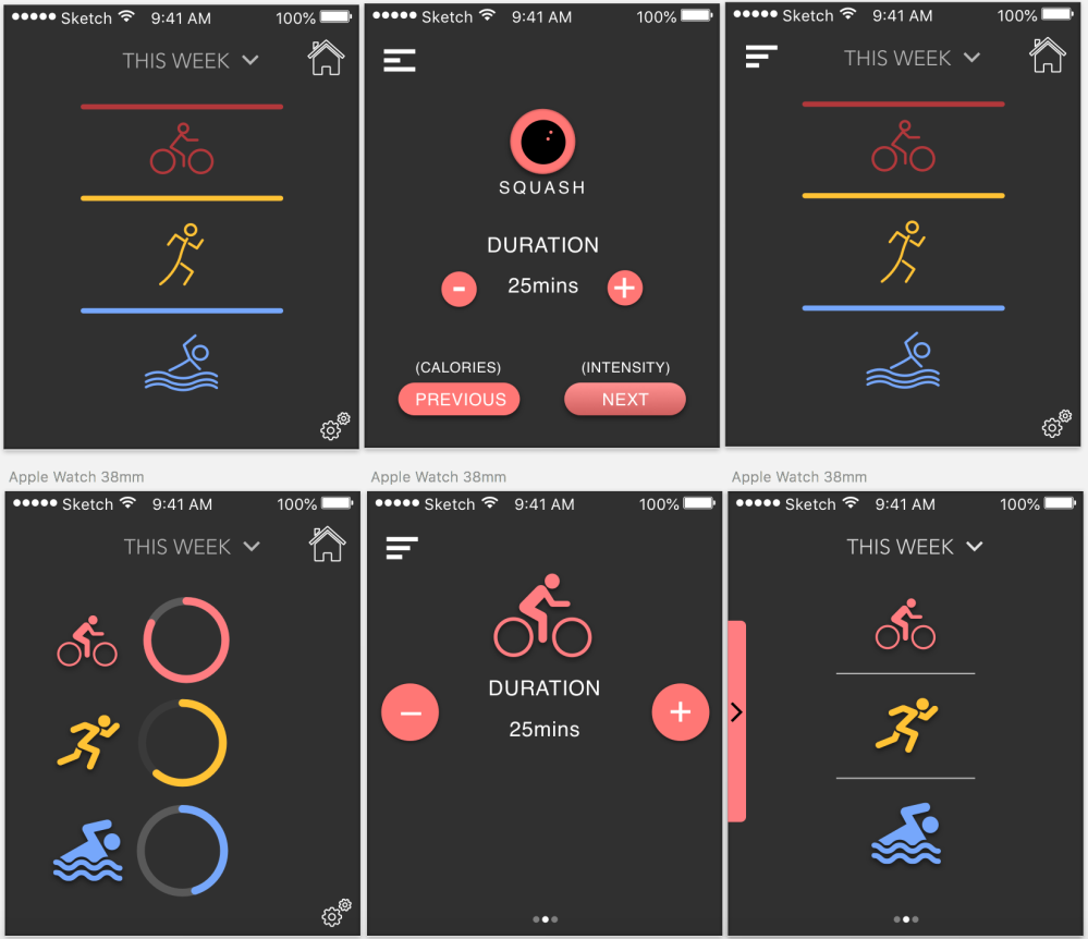
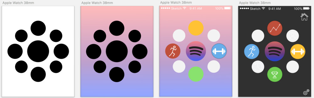
I was also trying to design my app on the apple watch platform, because of the sizing of the screen the amount of information on one screen had to be as little as possible. The size of the buttons also need to be big enough for the finger to press, but not too big for the user to press the wrong one by accident.

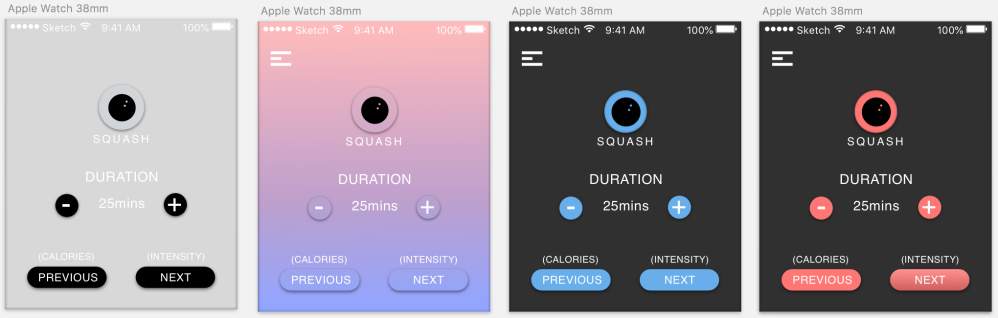
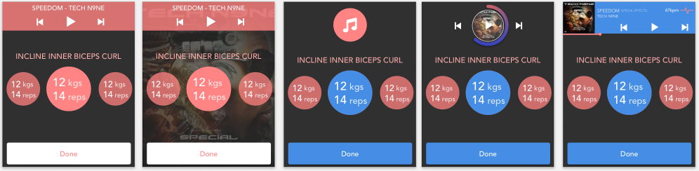
I started off by keeping nearly the exact same style as i used for the mobile app, however i felt that the screen was far too overcrowded and the buttons would be far too small and close together for the user to press.

Screen Shot 2018-06-07 at 17.14.59

I then changed the information to a vertical design instead of horizontal, i also took out the music section. I still wanted it to be easy for the user to access their music, so i designed two different small tabs that would either sit at the top or the side of the screen.

Screen Shot 2018-06-07 at 17.15.10

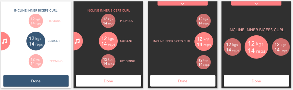
I wasn’t sure if breaking up the pink with blue was a good idea, so i thought it might be just as clear to make the current workout larger, with a blue ring around it. To optimise the small space of the watch screen, i thought that the resting timer could be a circle design to go around the number instead of a horizontal bar.

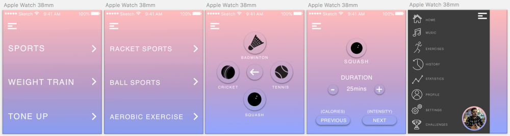
I then started to design the music page that would be swiped from the side of the screen, although the screen is a lot smaller, the user would still need the same amount of information on it.

Screen Shot 2018-06-07 at 17.15.20

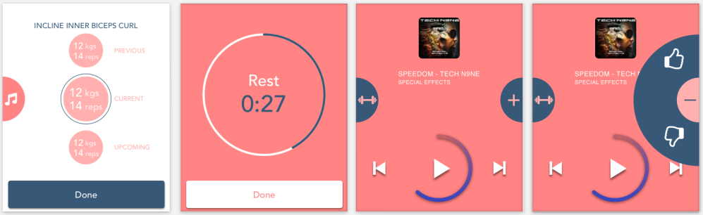
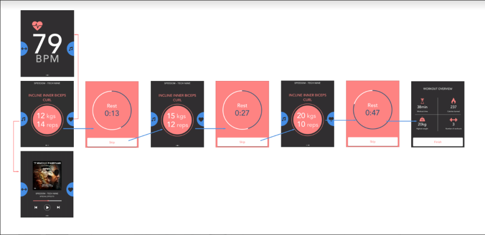
I eventually got my design right, i decided to go for a dark background as i felt that being a small screen on a wrist, the colours would need to contrast from the dark background. I took bits of screen information off and seperated it all, the different parts of the workout have menu dots at the bottom. Then to save space, i designed tabs on the sides of the screen, allowing the information to be easily located and not overcrowded.

Screen Shot 2018-06-07 at 21.24.49

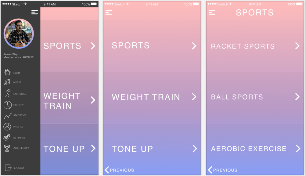
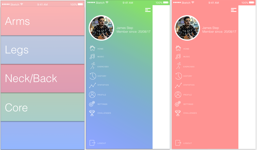
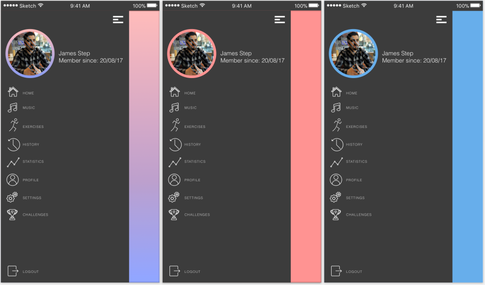
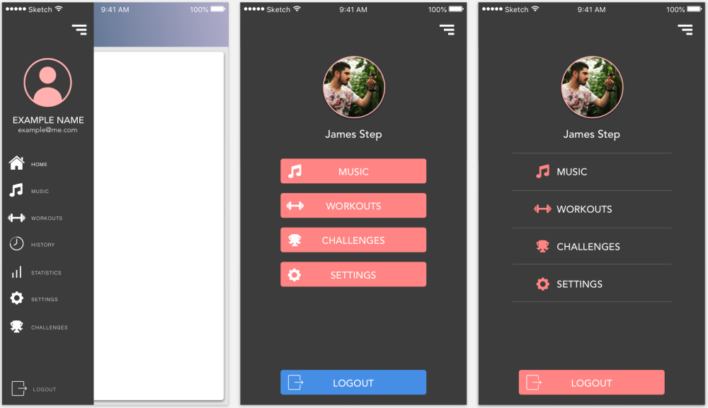
One of the most important parts of the navigation on the app is the side bar, i started off with a small squashed design, then continued with a design that covers the whole screen. I designed pink buttons in the centre to stand out, but found that plain white text with a pink icon is a lot clearer and easy for the eyes.

Screen Shot 2018-06-07 at 21.25.42

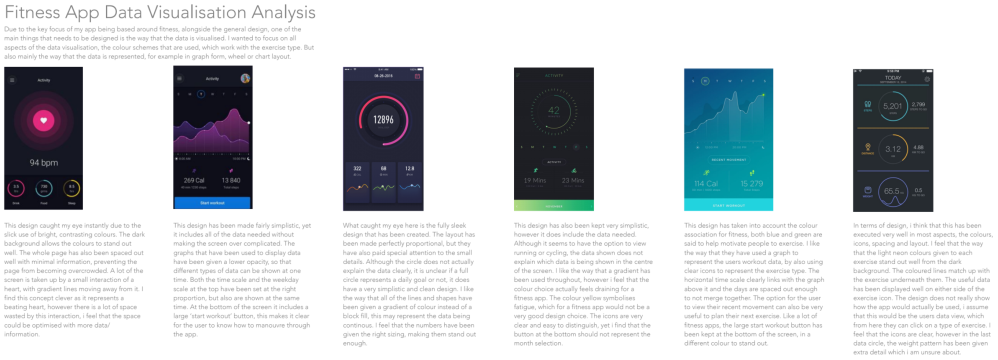
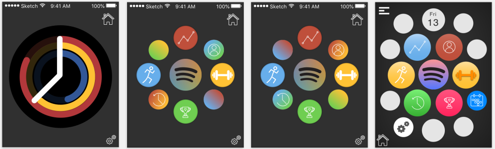
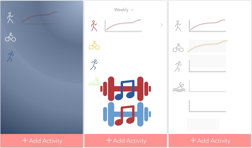
To show the users progress and stats of their workouts, i thought that it would be a good idea to locate them on the profile page. The profile page would have two sections, the basic information and then a further overview displayed on a graph.

Screen Shot 2018-06-07 at 21.26.32

F.M.P – Week 14

I had finally found the style that i wanted to keep throughout the app, so i was now creating screens that would make the app seem more realistic.

Starting with the login page, i created a version that i really liked but i did not like the part with the music app symbols. So i designed two buttons for the user to login with instead.

Screen Shot 2018-06-03 at 12.56.07


The next screens i started to design were the creating account screens, i wanted to get the spacing but also the icons correct.

Screen Shot 2018-06-03 at 12.34.29

After looking at inspiration online, i found that it looks a lot better and also improves usability by having a faint line and instruction. In the create account section i wanted to let the user have the ability to create a unique experience. Screen Shot 2018-06-03 at 12.34.57

I then continued to design screens that would help create the experience for the user.

Screen Shot 2018-06-03 at 12.35.09

I continued to design the screens for the challenge section, this would be a feature for the user to have challenges set for them to complete on a daily basis.

Screen Shot 2018-06-03 at 12.54.07

I wanted to come back to thinking about the main idea of the project, where the user creates their own workout and then the app creates the playlist for them.

Screen Shot 2018-06-03 at 12.55.26

Looking at other fitness apps, i noticed that one of them gave the user the ability to copy a previous workout, i thought that this feature could work well with my app, especially with the set playlist.

Screen Shot 2018-06-03 at 12.55.36

I updated my workout page by adding in the icons to represent the area of workout for the user. I decided to go with the design where the user would click a dropdown menu to open up the specific muscle area that they wanted to select the exercise from.

Screen Shot 2018-06-05 at 20.15.26Screen Shot 2018-06-05 at 20.15.36

I thought that it would be a good idea to have a pre set workout page, which would mean the user can easily do a random workout. I spent time playing around with gradients and solid fill colours to create the right scheme to match the difficulty.

Screen Shot 2018-06-06 at 19.41.56.png

When looking at other apps and the way that the options section was designed, i started to think about the spacing and the colours to prevent the app looking overcrowded. Screen Shot 2018-06-05 at 20.13.49

I started to think about the screens inbetween planning a workout and actually carrying it out, therefore i designed a page that let the user know their playlist was being created and that they should always warm up.

Screen Shot 2018-06-05 at 20.16.15

I then continued to keep changing the design of this, i added in the section about connecting to the sensor, but also added loading wheels, so that the user could see the loading progress. I then added a red bar over the warning stage as this would stand out far more than just words.

Screen Shot 2018-06-05 at 21.04.03

I still felt that the page was overcrowded, so i then redesigned it to make the symbols a lot smaller and took out the words and replaced them with a tick symbol. I think that having 3 smaller icons with a tick next to them is a lot more clear.

Screen Shot 2018-06-06 at 19.49.07

After this i started to think about the actual page that would be displayed when the user is working out, this page would need to include a range of information, however it needed to be clear and laid out well. I had designed a music bar at the top, which had a measurement of the users heartrate, so that the music could be changed depending on how fast or slow it is.

Screen Shot 2018-06-06 at 16.08.43

I felt that circles worked far better than a rounded edge rectangle as having one solid block of colour in the middle was not very clear to read. With three separate circles, it shows that they are three parts of the workout.

Screen Shot 2018-06-06 at 11.20.06

I then changed the circles to make it clearer, i designed it so that the previous completed workout was faded out with a tick, the upcoming one was left normal, and the current workout was scaled up by an extra 20%.

I then changed the bpm and the song choice at the top of the screen so that it would show the playlist changing depending on the bpm recording. I also removed the heart shape and replaced it with the heart beat line, as i felt that this less complicated and easier to read.

Screen Shot 2018-06-06 at 16.39.28

I then designed the screens for when the workout had completed, the previous workouts have been faded and crossed out above the current workout. After the workout has finished, it will then take the user to their overview where it will tell them the details of their workout.

Screen Shot 2018-06-06 at 16.39.45

I then started to work on the screen where the user would be able to see their music in more detail. If the user clicked the minimised music player, it would then open up a screen that looks like this.

Screen Shot 2018-06-05 at 20.15.07

F.M.P – ALL RESEARCH DOCUMENTS


F.M.P – Week 13

I wanted to create an app concept that had a simplistic design with good usability, but also had all of the key features that it needed.

I took a step back from my work and imagined that i was the user, using a screen that small. I took my original designs and changed the icons, i then started to think about the colours and the sizing and spacing of the buttons. By removing the previous and next buttons from the screen, i was able to create screen space by adding the page indicator at the bottom. I started to change the colours and thickness of the lines to give it a cleaner look.

Screen Shot 2018-05-22 at 19.45.14

I was still thinking about how i would categorise the different types of exercise for the user, in a way where there would be no overlapping exercises in more than one category. I made a design of how the screen could look, it would be a very simple design, using 3 images and capitalised font on top for easy navigation. After that that the user would be able to specifically select their exercise plan and the different options to personalise it.

Screen Shot 2018-05-22 at 19.43.51

After having a tutorial with feedback, i was able to make some amendments to the way that the app concept would work. For example i thought about how music would be used with sports, most of the time sports will be done with multiple people. This therefore limits the music aspect in a number of ways, the user would have to find music that suits all players, but also the sports would be far too loud for the music.

After creating personas, userflows and wireframes, i then started to think how the app would run from the download stage. I thought about how the user would know how they were going to incorporate their music, so i added some logos to show what music apps could be used. I started to play around with a few colours to see what would work best with a white font.

Screen Shot 2018-05-22 at 14.16.56

By using a placeholder colour of pink, i started to think about how the user would create their account and personalise it. I spent some time playing around with icons, font width and sizes and also capitalisation of words. I wanted the right words to be in capitals and the input sections in lower case.

Screen Shot 2018-05-22 at 14.17.14

Continuing with the account personalisation, i was designing the pages for the user to decide what their goals were, but also create sets of workouts depending on what equipment that they have.

Screen Shot 2018-05-22 at 14.17.45

I then started to design the page where the user would be able to personalise the songs that are played during a workout, by selecting a number of songs that they would find preferable.

Screen Shot 2018-05-23 at 18.44.49

I had always used a pink colour with the same style, so i decided to use a different colour and gradient and then completely change up the style of the app. I thought it may look good to have a white background, but i found that it was too basic so i decided to use a grey background with a white overlay.

Screen Shot 2018-06-03 at 13.14.31

Adding a white overlay over the top of the grey background it makes the app look less flat.Screen Shot 2018-06-03 at 13.14.44

Screen Shot 2018-06-03 at 12.33.27


F.M.P – Week 12

While designing this app, i had only been thinking about it on a mobile platform, this gave me the idea that i wanted it to be used more. For example, smart watch, i thought about computer level but it seems that a computer is less likely to be used while working out.

Although i was sceptical about designing for a computer based app, i still did the research into what was already on the market.

Another area that i find important with any fitness related app, is the way that the data the user creates is visualised. So i picked out some that i found online and decided to analyse the different parts that make it up.

To continue my research into the platforms that my app could be designed to work for, i thought about the smart watch/apple watch and conducted some research. I started off by looking at general apps designs to understand the proportions and what was important.

To understand fully what sort of things that were kept in mind when designing for this platform, i read an article. – Important design aspects for watch design

After analysing some of the general apple watch app designs, i then looked at some fitness specific designs.

I started out by sketching some ideas for how the screens could look on an apple watch scale, this included some of the features of the app, including:

  • Music
  • Workouts
  • Statistics
  • Exercise selection

20180508_123147

The first aspect that i tried to design on the apple watch scale was the main menu screen, where the user could select what they wanted to do easily. I started off by finding the right layout, i then started to add colour and symbols. After that i changed the background to a dark, so that the coloured symbols would stand out better.

Screen Shot 2018-05-08 at 12.51.29

I then shrunk down one of the designs that i had created for a mobile device, i made the aspects smaller and took out some details of the page and then added in previous and next buttons to save room. Screen Shot 2018-05-08 at 12.51.50Screen Shot 2018-05-08 at 12.51.12

I continued with designing a menu screen for the contents of the app, i played around with gradients of two colours for the icons, then decided to go with flat colours with a subtle gradient.

Screen Shot 2018-05-08 at 12.53.37

One of the main features of the app is the music aspect of it, therefore i needed to have a music screen. So i decided to design some screens, proportional for the watch face.

Screen Shot 2018-05-08 at 12.59.38

I started to look at one of the designs that i had for mobile, then shrunk them down and redesigned them to fit onto a smaller screen.

Screen Shot 2018-05-08 at 13.05.43

I started to think more about icons, i noticed that on some apps the icons are filled and some are simply just a stroke line. I then noticed that some apps use a stroke line icon, which fills when the screen is being used. I took some time out to think about the icons that i had used, i updated the icons that i had used, then did two versions of the same screen, one with block fill icons and one without.

Screen Shot 2018-05-09 at 17.01.16


F.M.P – Week 11

In my 11th week of the project, i was thinking more about the functionality of my the app that i was designing, what its unique feature was and what it would look like.

I started to design the way that the app would be used when the user is deciding on what exercise they want to do. From there they would be able to set their intensity, duration or how many calories that they would like to burn.

To help the design process of the app, and understand more who the app is created for, i decided to create some personas.

Before i was able to fully design a fitness app, i needed to look at some that i had already been designed. I found that the best way to workout what i needed to do was to create some user flows with different apps.


Before i did this, i wanted to workout which was the best way to categorise the exercise that the user would be carrying out.

Screen Shot 2018-04-23 at 10.47.45

Once the user has decided what they would like to do that day, they would be taken to another categorisation section. The first screen that i designed was the racket sports screen, i had a go at designing different looking icons, then tried having them both horizontally and vertically to see which looked better.

Screen Shot 2018-04-23 at 10.53.23

I started with a design for just a vague aerobic exercise, i used a gradient form to break up the different sections of the screen.

Screen Shot 2018-04-23 at 10.45.10

This design then carried on to my racket sports screen, however i decided to tone down the gradient opacity so that it blended better.

Screen Shot 2018-04-23 at 11.03.07

During this process, i thought about other ways that i could categorise the different types of exercise, but i found this all a bit clunky and not so user friendly.

Screen Shot 2018-04-23 at 10.44.52Screen Shot 2018-04-23 at 10.41.56

I was thinking that the app could be used to plan someones workout routine, for example set alarms and reminders in the future so that they don’t miss their workout session. I created a screen that was like a home page, on the front of it, it would have different appointments for workouts all clearly labelled.

Screen Shot 2018-04-23 at 10.40.22

I wanted this app to make it easier for the user to the user to be able to organise their time for when they are going to exercise, therefore i wanted to design part of the page where the user could select when to do their workout.

Screen Shot 2018-04-23 at 11.03.28

I had chosen a colour gradient at the start of the project and got carried away with it. I read an article at the start about what colours make people want to exercise and in what way.

Colours influencing exercise

Due to this i had not given it much thought on other colour patterns i used, so i decided to have a go at creating some more gradients that i felt could work well with my app design.

Screen Shot 2018-04-23 at 11.05.10

Due to the app design theme being exercise and working out mixed with music, i felt that it would be a good idea to have this app designed for more than one platform. I started to think about apple watches, the dimensions of them and how designs have to be completely altered to match the specification.

After having a tutorial session, i made a list of notes that i took away from the conversation that i had about my project designs.

Screen Shot 2018-04-26 at 11.00.06


F.M.P – Week 10

In this week i was starting to think about what sort of things i could put into my app, was it just going to be an app for working out, or could it include for example; their daily calorie intake and how much they have had to drink.

Screen Shot 2018-05-09 at 13.32.15

To help the design process of the app, and understand more who the app is created for, i decided to create some personas.

So i started to design some icons, i felt that by designing them, it would help me to direct the other design for the app in general.

Before i started to digitally design ways of showing data and selecting a workout, i used a pen and paper first to create some wireframes.

20180406_153028

I put the icons that i had created onto a gradient that would seem like an app, i wanted to see how the sizing would work and whether a blurred icon would look better than a normal one.

Screen Shot 2018-04-13 at 20.35.50

I then started to think about how to actually display the data that would be gathered from the app, over different time scales on graph form. I then also started to think about a logo, a basic first design was a music note on top of a dumbbell, but i will not be keeping this idea.

Screen Shot 2018-04-13 at 20.37.58

I generally started to think about how the app would create a list of songs for the workout that is live, so i thought about what it was that the app would need to work with to create it. I also thought about how a loading page would look when the music playlist was being created.

Screen Shot 2018-04-13 at 20.50.00

I wanted to then create some sort of user flow with pen and paper before i designed it properly on a digital scale.

20180508_113837

I took a different route and tried a different design for the layout of the exercise section. I wanted it to make it easy for the user to decide what area of muscle that they want to work on. I also started to look at the way that side menus work and what should go on them.Screen Shot 2018-04-13 at 20.59.15

I then continued with the side menu idea, i really liked the way how the dark menu contrasts with the light coloured app, but also how the circle around the profile images matches and breaks up the dark colour.

Screen Shot 2018-04-13 at 21.00.10

I started to play around with different style ideas to make my app look different. I used different sized colour circles with a gradient, then overlapped them to give them an uneven effect.

Screen Shot 2018-04-16 at 22.25.53

I then started to think about what my app would look like if it were in an app store and did a first idea for the icon. I wanted to incorporate both music and working out into one easy icon, so i used a man holding a weights bar, which is actually a music note.

Screen Shot 2018-04-16 at 22.31.38

F.M.P – Week 9

After thinking about the design and the user, i thought back to the unique feature that this app was supposed to have. I wasn’t sure whether it would work better to reward the user to workout, or punish them for missing their workouts.

The first idea was that the user would have their bank card linked to their account on the app, this would then donate money to a charity if they missed their workout session. The second idea i had was that if the user missed their session, the app would generate the next workout plan for them, which would be harder. But then i realised that the idea of the app wasn’t to annoy people, by doing this the user could just easily uninstall it.

20180406_153006

To get an understanding of what a donation/ reward screen would look like, i picked out four that stood out to me and analysed them.

Another feature of my app that i felt was important was for it to have its own calendar system, either designed simply just for working out, or to integrate daily tasks with. For this i needed to look at some design inspiration and then start sketching and designing some of my own.


20180406_153033

I started to design my own calender, with a fairly basic style to it. I wanted to get to grips with what was the most important parts of the screen that would be looked at, from there i could workout how to actually design it in terms of spacing and sizing.

Screen Shot 2018-04-12 at 19.00.11

From there i started to add some colour to the screen to test out what worked well together. I started off with a warm mix of orange, purple and blue to create the gradient, with a contrasting white font on the top of it. I think that i have carefully spaced out the page, it doesn’t look too bunched or overly crowded. However, the one problem that i had was allowing enough space for the days schedule.

Screen Shot 2018-04-12 at 19.01.02

I then tried to create a calendar with a different layout, i like the way idea of having the dates moving horizontally, it allows the day to do schedule to have a lot more space. However, if a day slot is empty of barely filled, it will leave a lot of empty screen space.

Screen Shot 2018-04-12 at 19.03.30

Using the inspiration that i found online, i combined a gradient and colour scheme that i created, with a similar design that i had seen.

Screen Shot 2018-04-12 at 19.05.26

One of my favourite features that i saw in my analysis, so by looking at this and another calendar design i mixed the two together to see how it would look.

Screen Shot 2018-04-12 at 19.02.51

When i was designing i started to wonder on what screen my phone would fit on, depending on the button sizes and padding, therefore i had to look online at the guidelines to both the google and apple mobile app design.

Google material guidelines

Apple material guidelines